
Making Parking Payments Easy for Everyone.
Problem Statement
Payment parking machines want to offer a quick alternative to having an employee working in ticket booths, however older generations are struggling to use these machine as they are far more complex than a handing cash to a real person. These new machines should strive to make this process as painless and quick as possible by designing the physical machine around the order of the steps presented on the digital screen.
Project Overview
Redesign of an Interactive Interface is a parking payment machine that reads tickets and displays the fee to be paid by the customer(s). It solves a previous usability problem by redesigning the physical machine to follow the steps provided by the digital interface. My role was UX and UI designer. I collaborated with classmates to verify the design worked based on the project criteria.
Define Stage
User Problems
We were given a User Story (a narrative which goes over what the user’s actions and pain points are) to analyze and reference while making the task documents. The story revolved around an elderly couple who were unable to use a parking payment machine so they could leave the underground parking area. They required the assistance of another individual who also remarked the machine was rather confusing to use.
Requirements
I was required to have a series of planning documents (task step, analysis, and flow charts) to back up my design rationale and a complete prototype with low fidelity wireframes (minimal detail) to illustrate my design thinking.
Discover Stage
User Flow Maps

Task Flow Steps, Chart and Analysis
I used a series of task step, analysis, and flow charts (design documents which go over the steps a user takes while using a product, or service) to determine how I could make this machine easier to use. These tools helped solve the issue of where the user was having their difficulties. It was not the steps which were causing the issue, but the physical layout of the machine itself. The steps presented on the digital screen were not terribly different from what you may go through at a retail store, or e-commerce site. The machine’s areas of interaction (where a user will make inputs and commit to certain actions) did not represent the task flow in terms of where they were laid out. These design documents were done in Adobe XD.
Design Stage
Wireframes
I created low fidelity wireframes in order to quickly illustrate a solution for the user’s problem. I made these in the same Adobe XD document as the design research tools discussed previously. This is the original machine (left) compared to the final version (right).
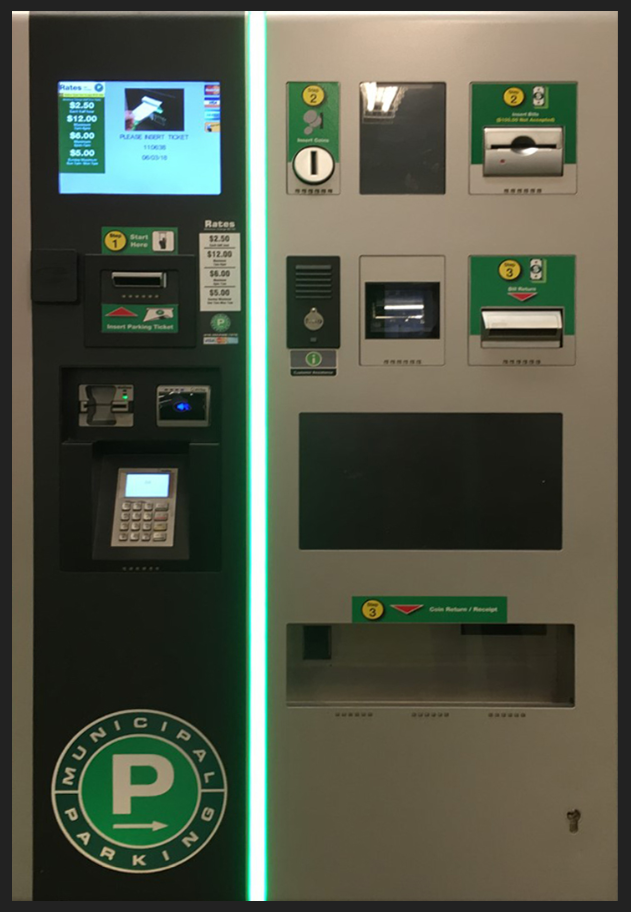
The idea was to make the payment machine more like a pop, or candy machine in terms of where the points of interaction should be laid out. Since these are so commonplace, most people have a relative idea as to how they work, whether they have used them, or not. Such familiarity should put less strain on their cognitive load (a term which describes how much information a user can take in at a given time). Now, instead of the payment and card area being separate from the main body of the machine, it is under the digital interface. To save room and make such a change possible, the pin keypad was removed and put into the digital space instead.
Idle Screen
Calculation Screen
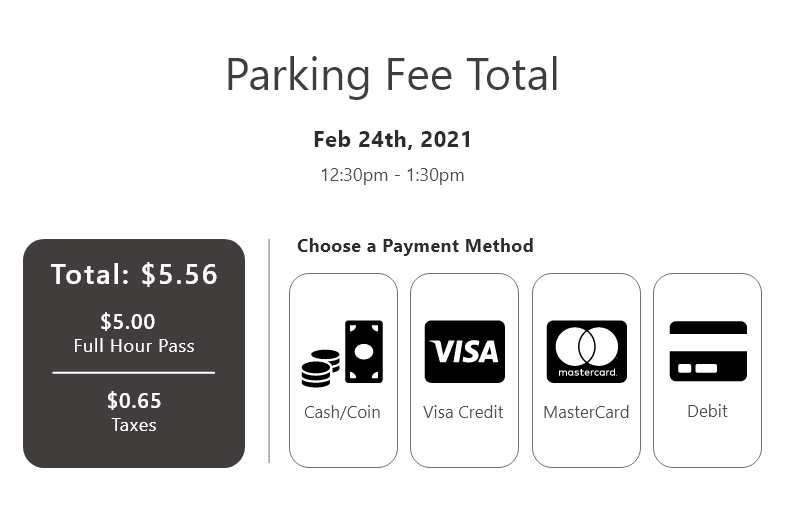
Parking Fee Total Screen
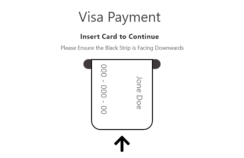
Visa Payment Instructions
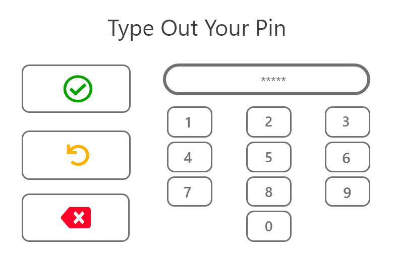
Pin Screen
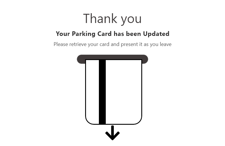
Updated Card Notice
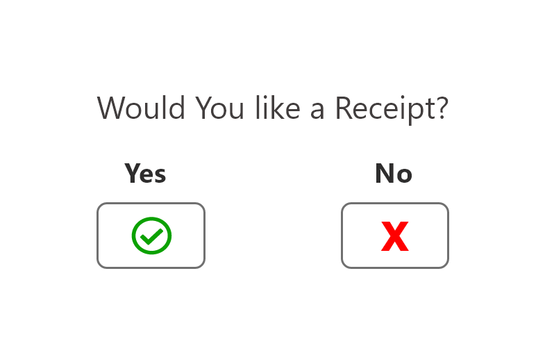
Receipt Option
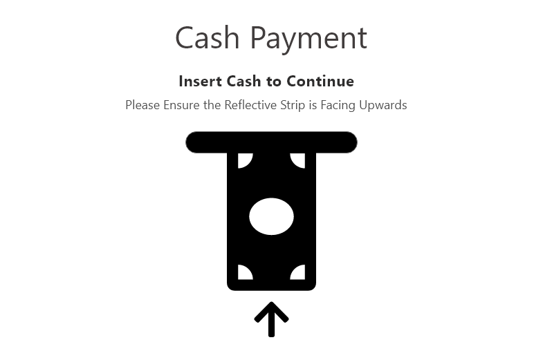
Cash Payment Alternative
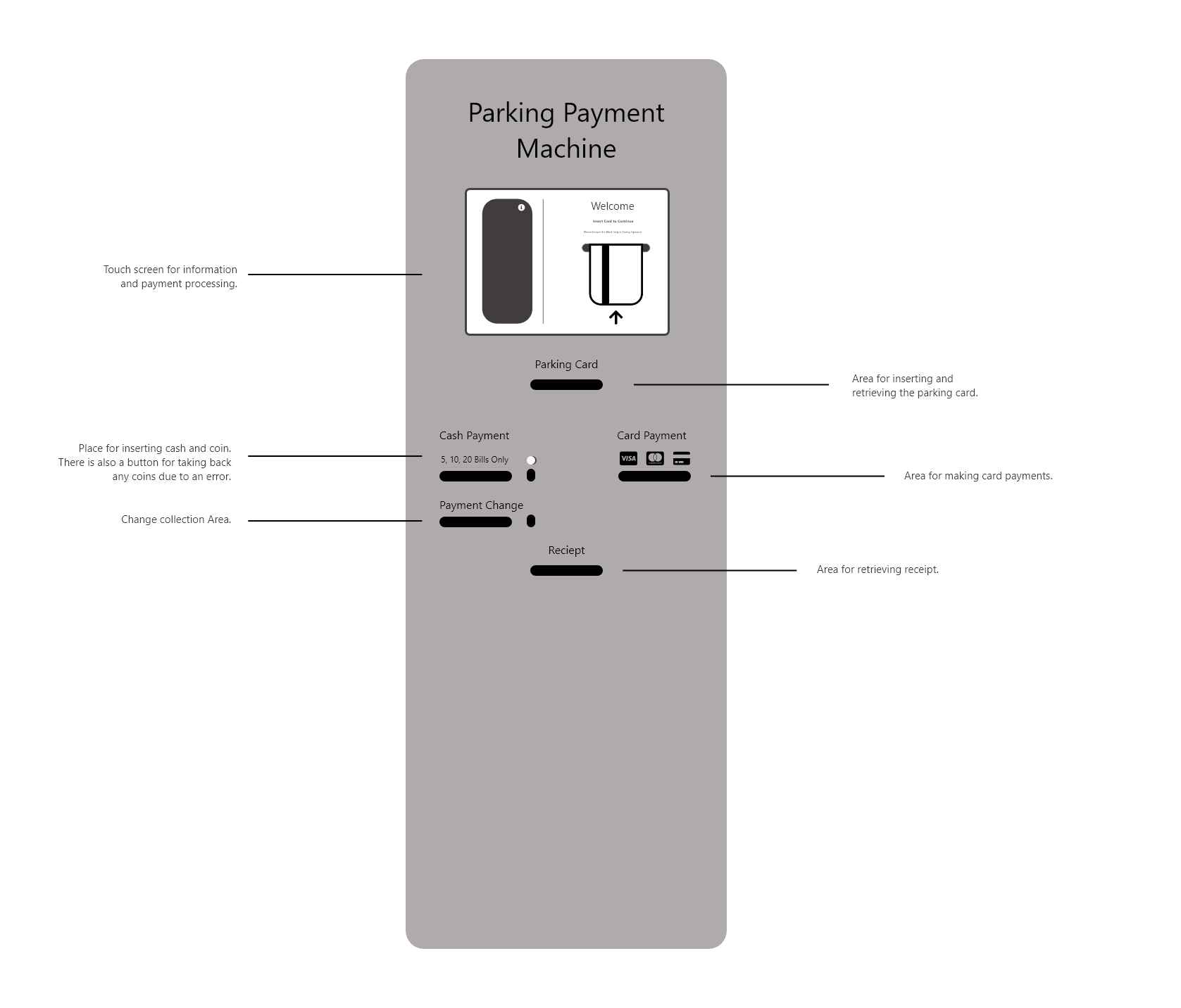
This wireframe (above) is an example of how the grid layout of the digital screens could be changed to better suit usability standards. The idea of having a fee reference upon arrival was a nice touch, but the layout and styling was very outdated and hard to read. This version aimed to be more minimalistic and legible by removing any unnecessary patterns and poor design choices. This was all done using prior design knowledge and heuristics.
Conclusion
This being a short class exercise, there was no user testing which could prove whether this current version fully fixes the problems from the user story. For the next phase of this project, tests would need to be done to see whether this new design works based on the findings brought up by the task analysis. This test should include a series of interview questions, tasks, system usability questions, single ease questions and post-test questions which allow for further feedback from the participant. From there the design will either be verified to work, or redesigns will need to be done to make it a better product. From there, the wireframes can be given more detail and brought into a higher fidelity range.
Overall, this particular exercise just goes to show how important the physical points of interaction are and how they can hinder the overall experience. Both the digital and physical aspects of any product need to be designed to fulfill the user’s needs, as either, it not designed well, can make for a terrible user experience.


