Companies were picked out of a hat for us to research and redesign the logo of. The goal was to learn more about the company, explain why current Logo wasn't working, then design and argue for our new concept. Done in 2019, this was later revisited in 2020 for a refinement and brand guide phase.
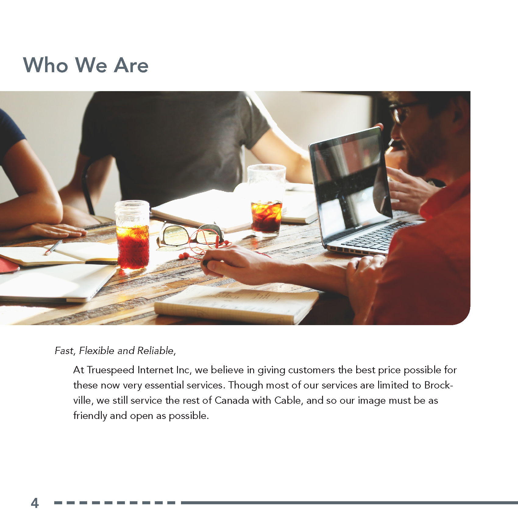
Truespeed internet is housed in Brockville ON, and they offer the area affordable internet and cable.
Truespeed has no affiliation with this project. This was a series of college mandated projects and was not requested/commissioned by the company. This, and all other companies, were assigned to students at random.
Comparing the Logos
The original Truespeed logo is to the left, while the re-imagined version is to the right. This redesign would later be put through a second design phase to correct the proportions and establish measurements such as the n-space. Bellow the both of them is the final iteration of the logo.
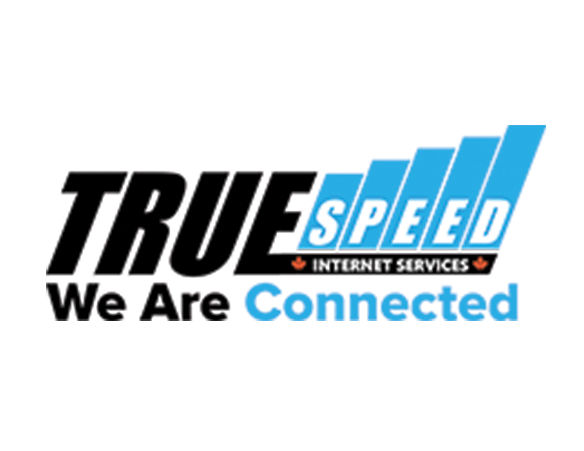
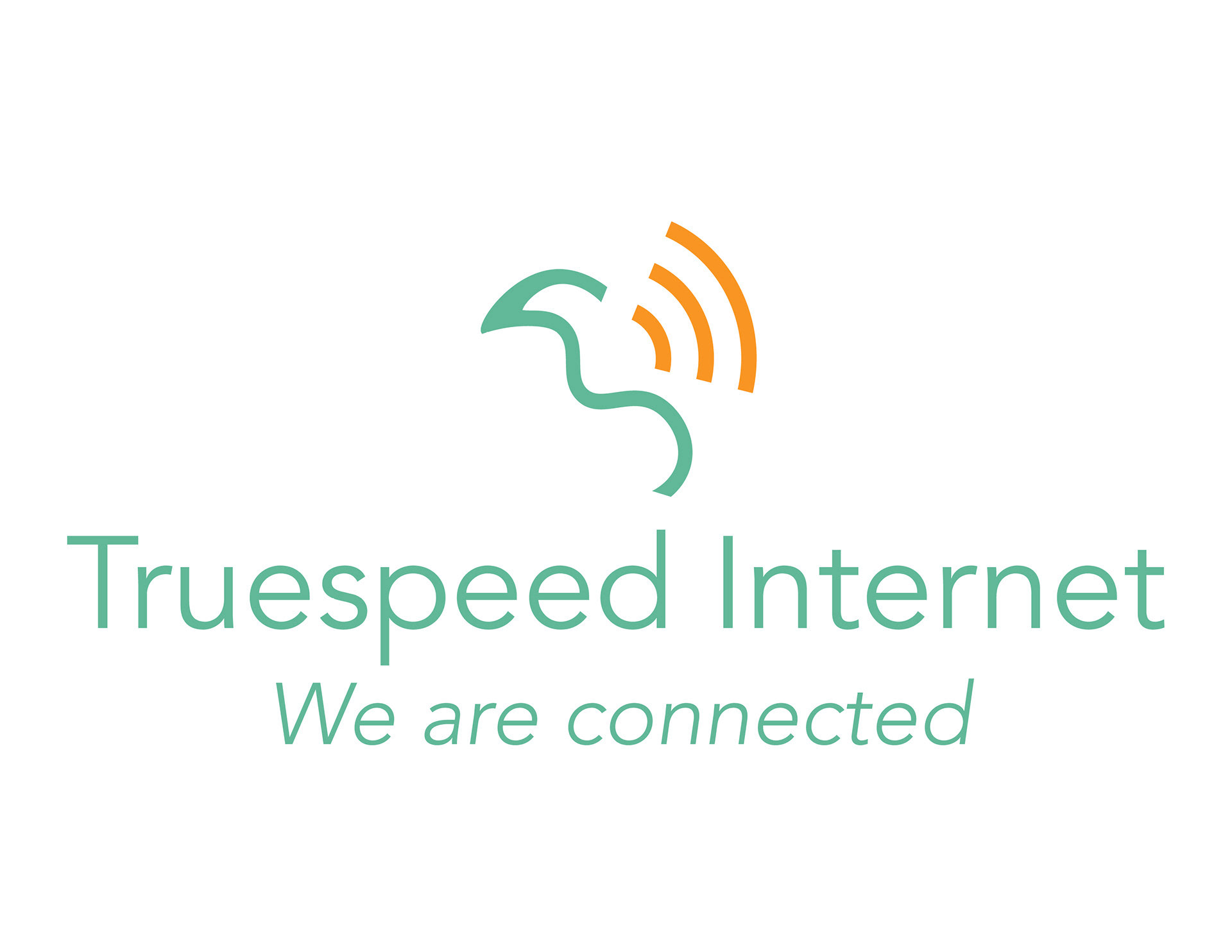
Original Company Logo as of 2019
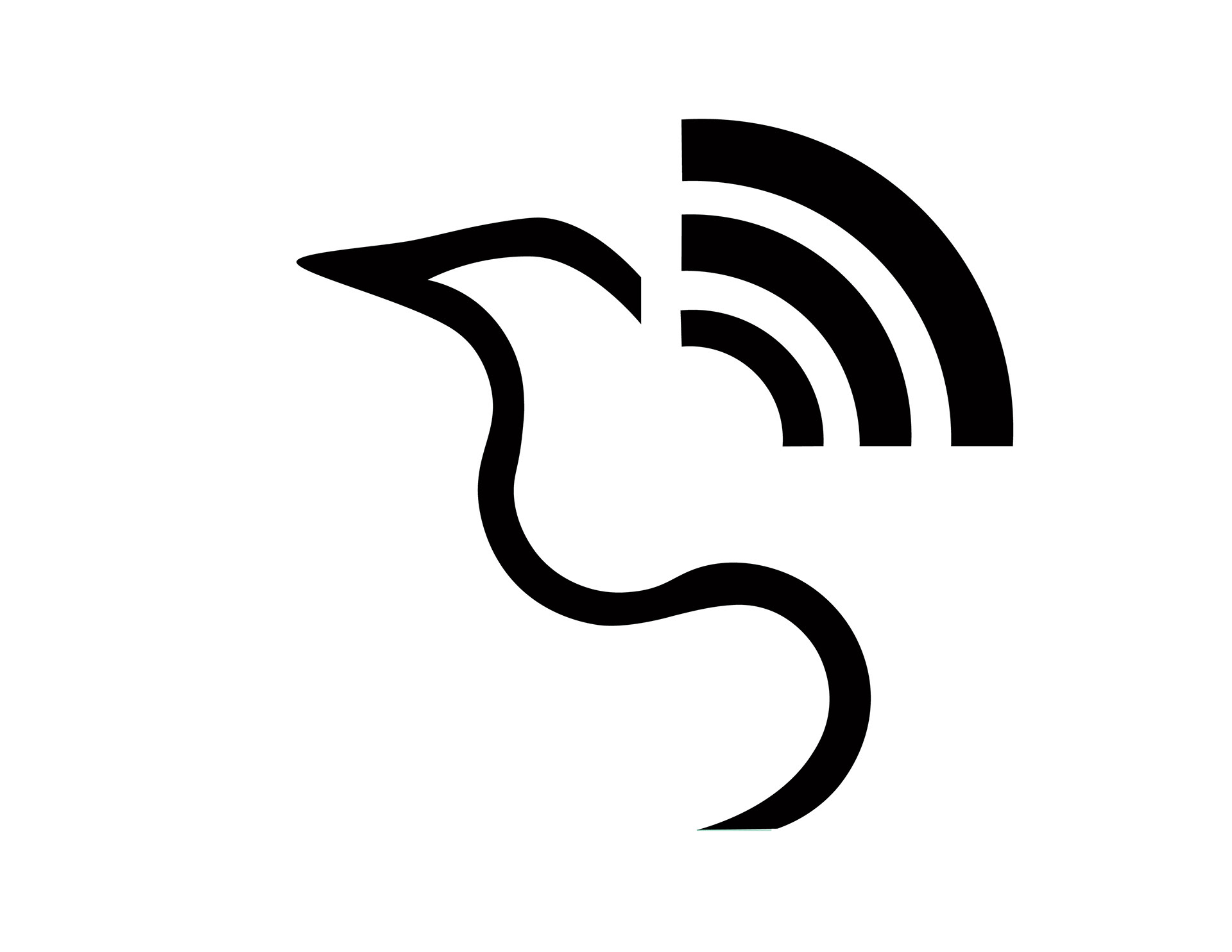
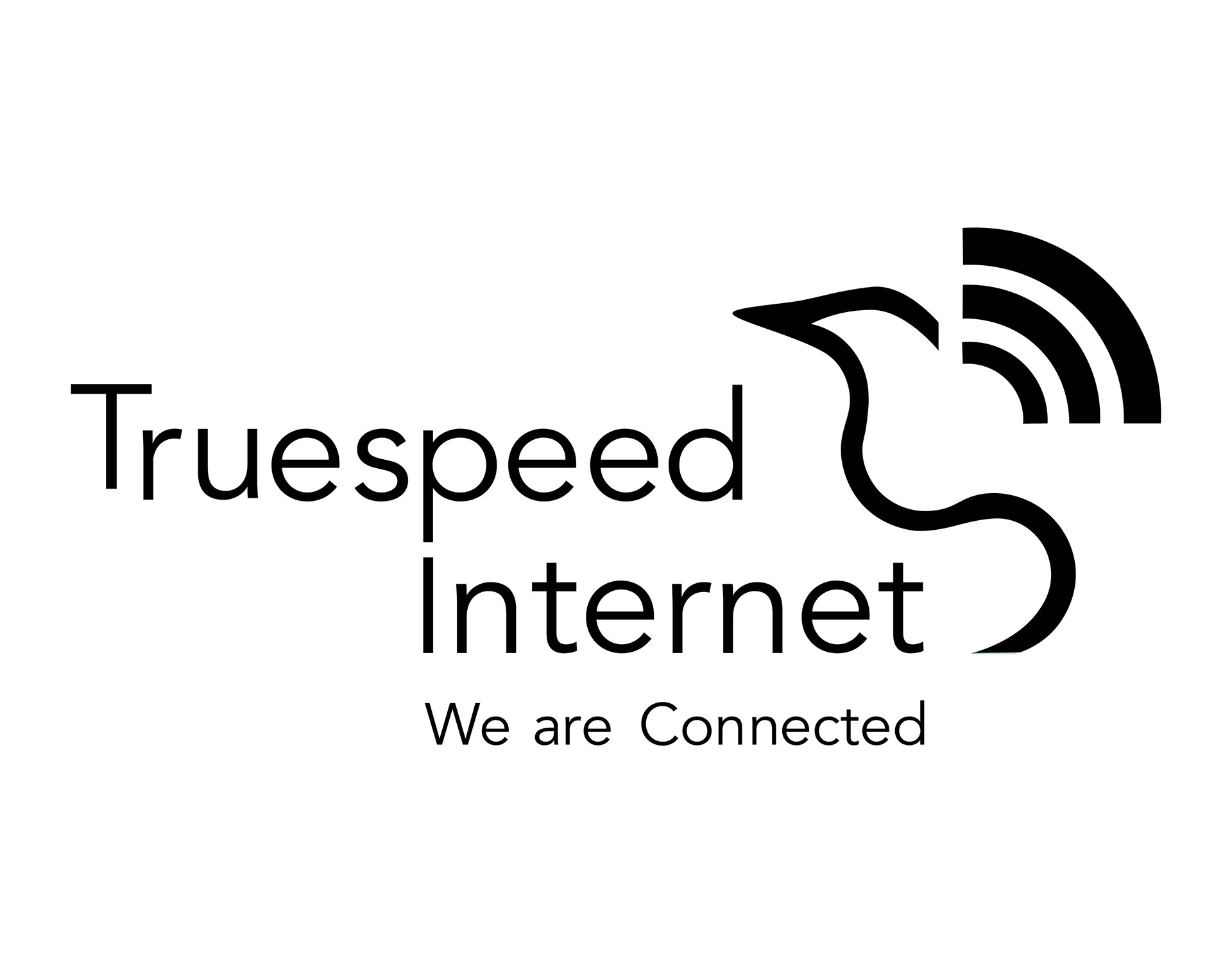
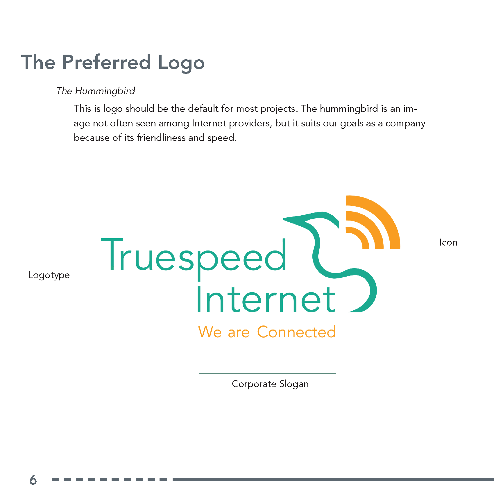
Final Logo Redesign
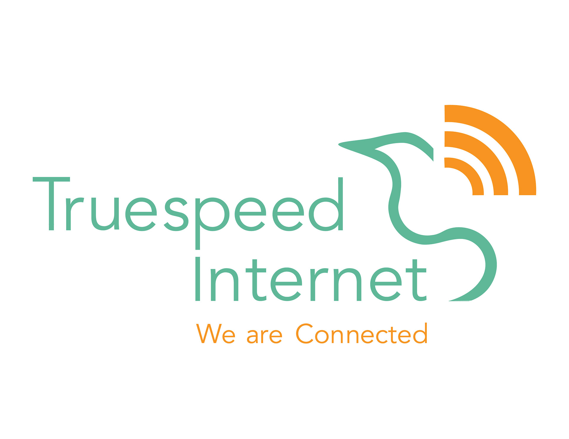
Truespeed Final Logo - 2020
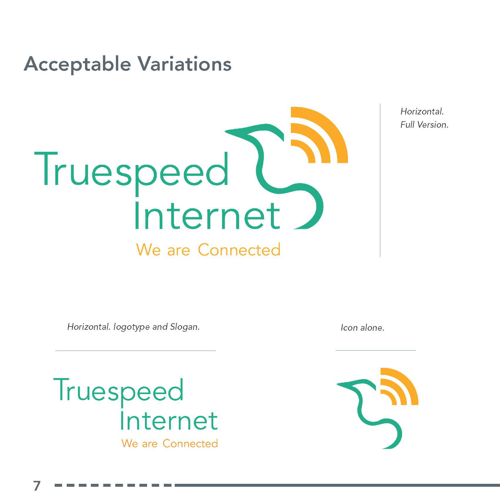
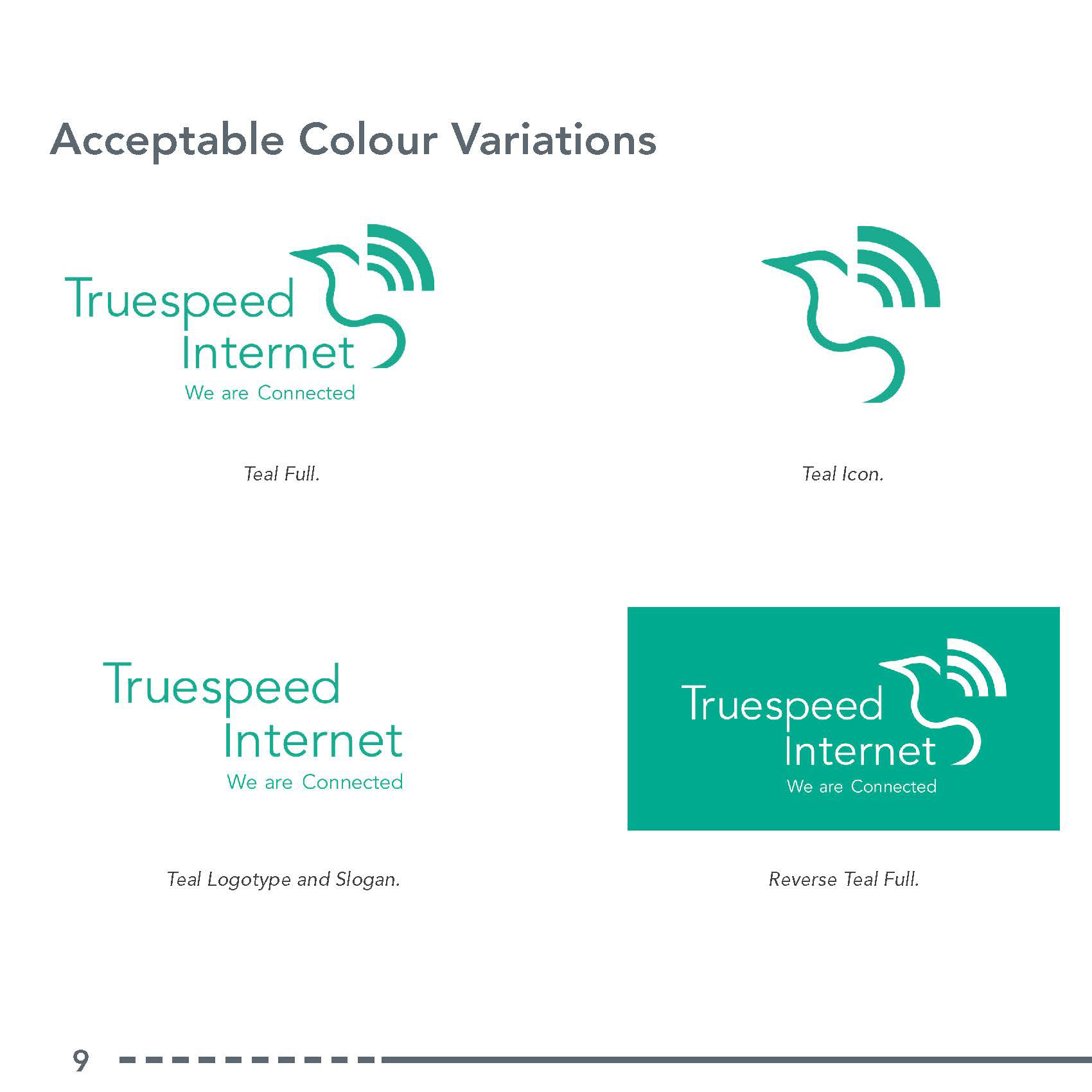
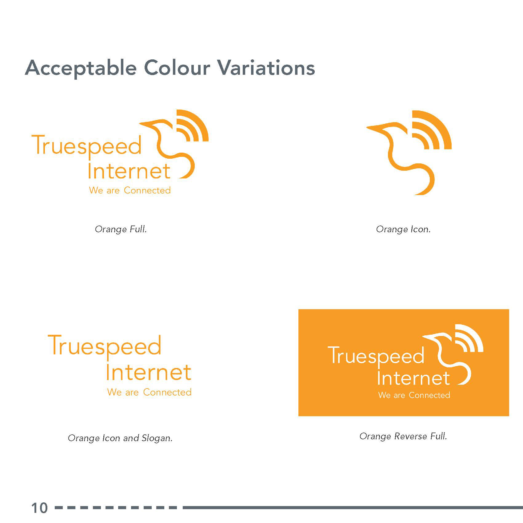
Acceptable Logo Variations
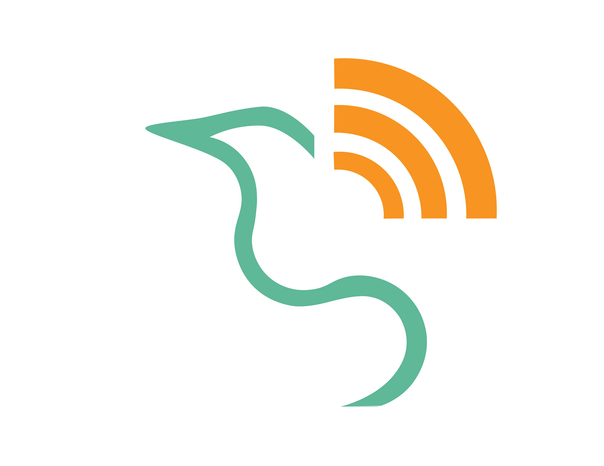
Stand Alone Icon
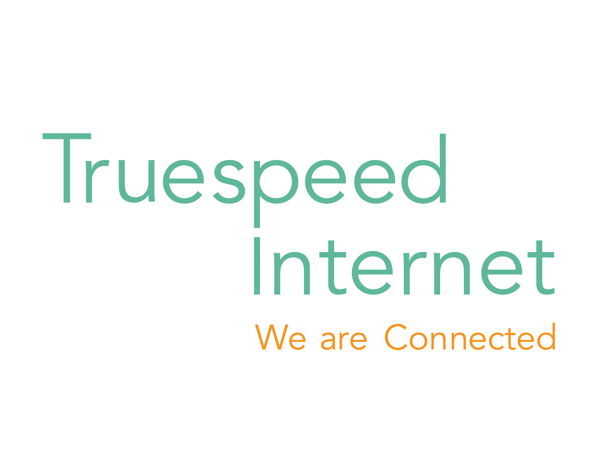
Wordmark and Slogan
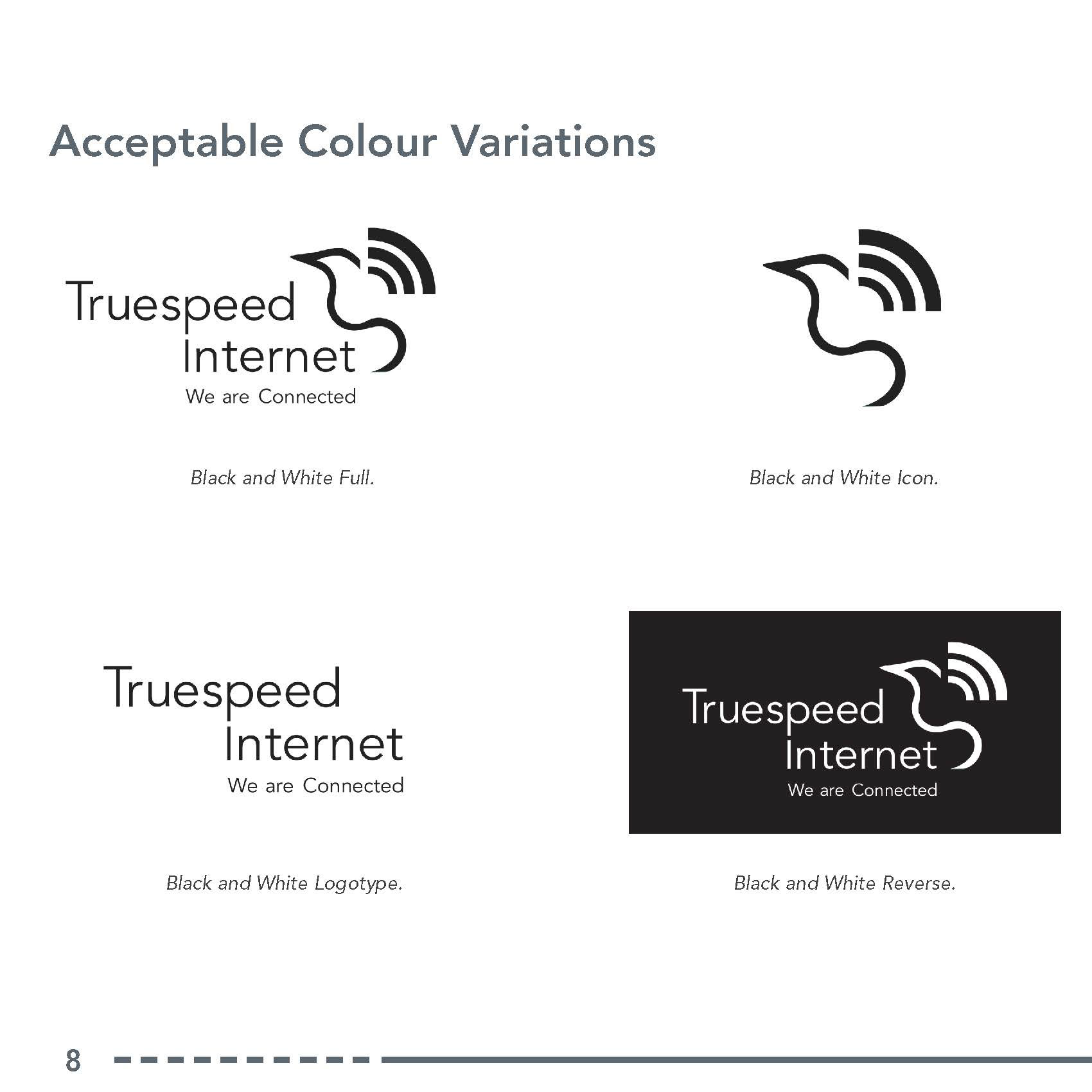
Black and White Icon
Black and White Full Logo
Style Guide
Opening Information

Additional Variations
Constructing the Logo
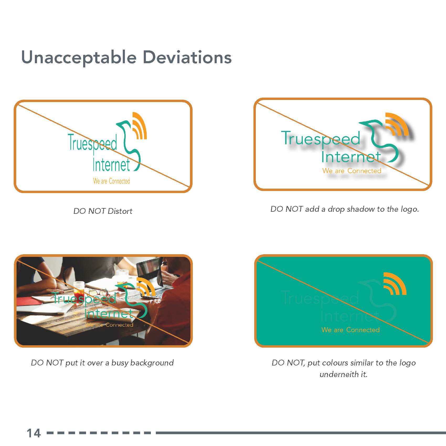
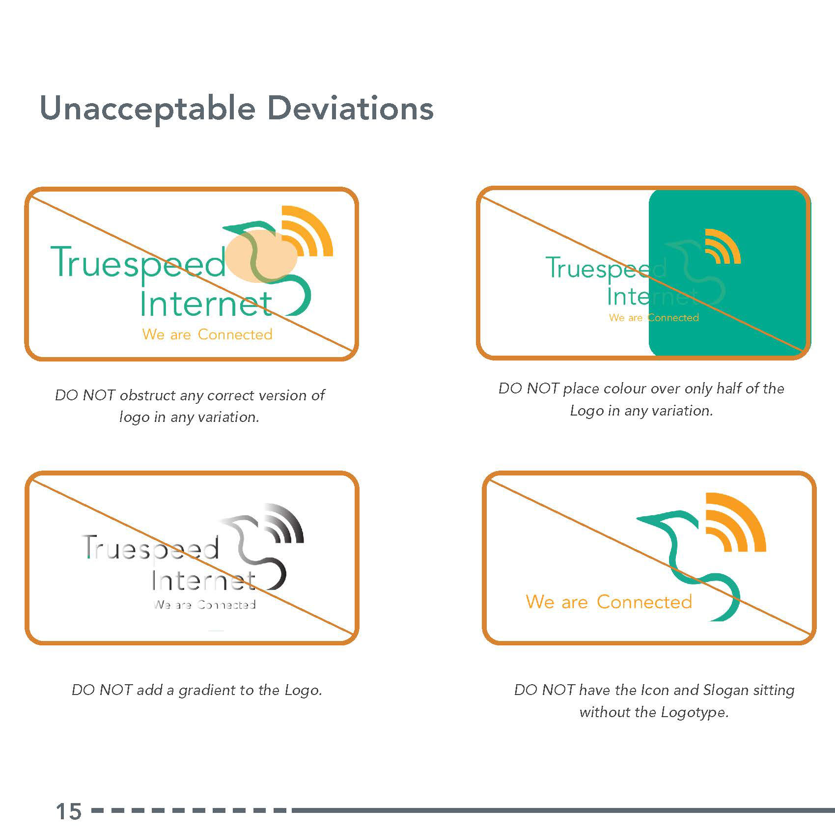
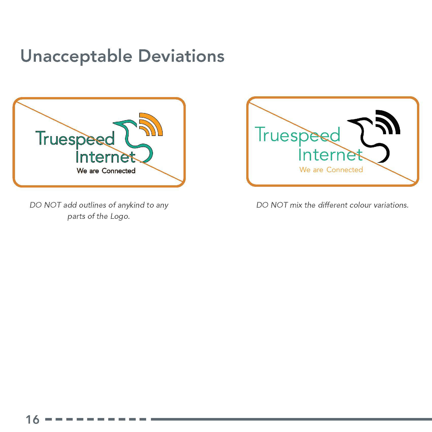
Unacceptable Deviations
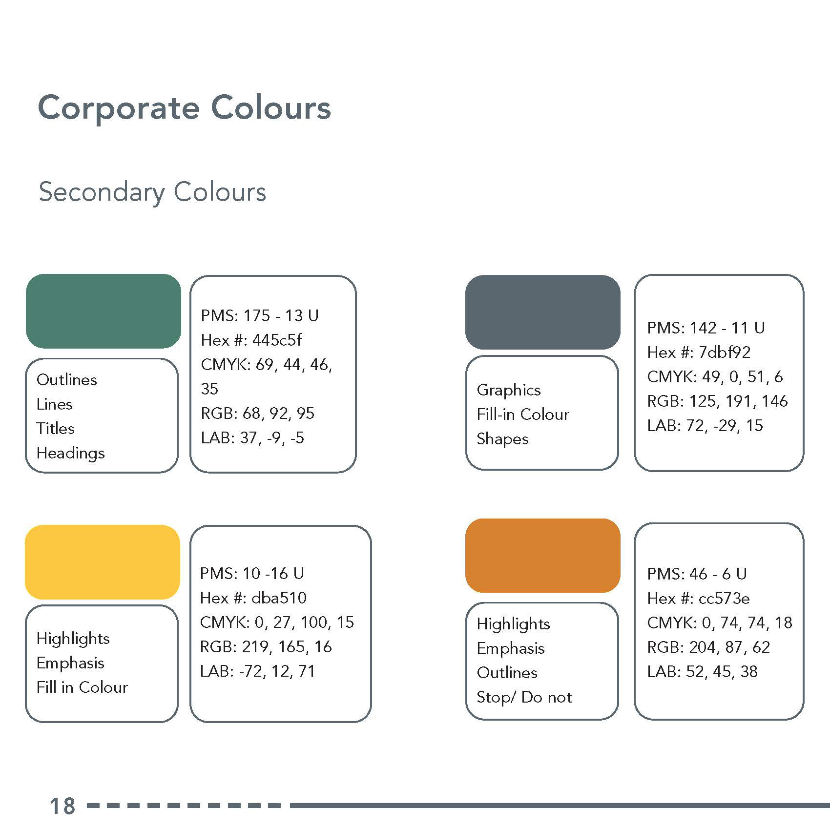
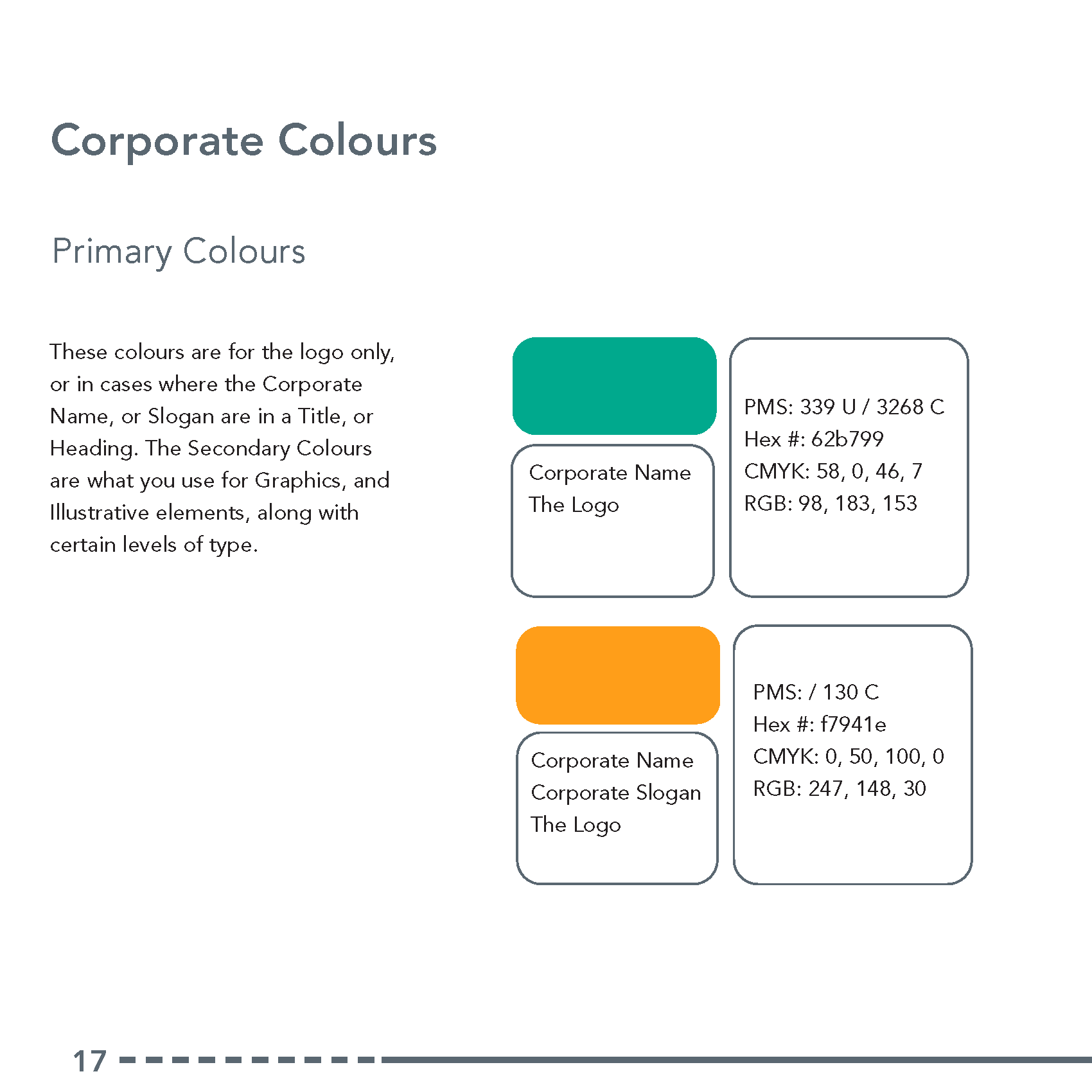
Corporate Colours and Their Uses
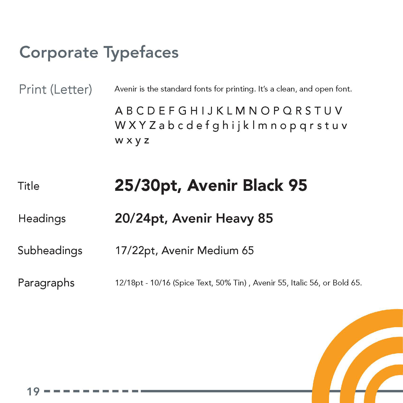
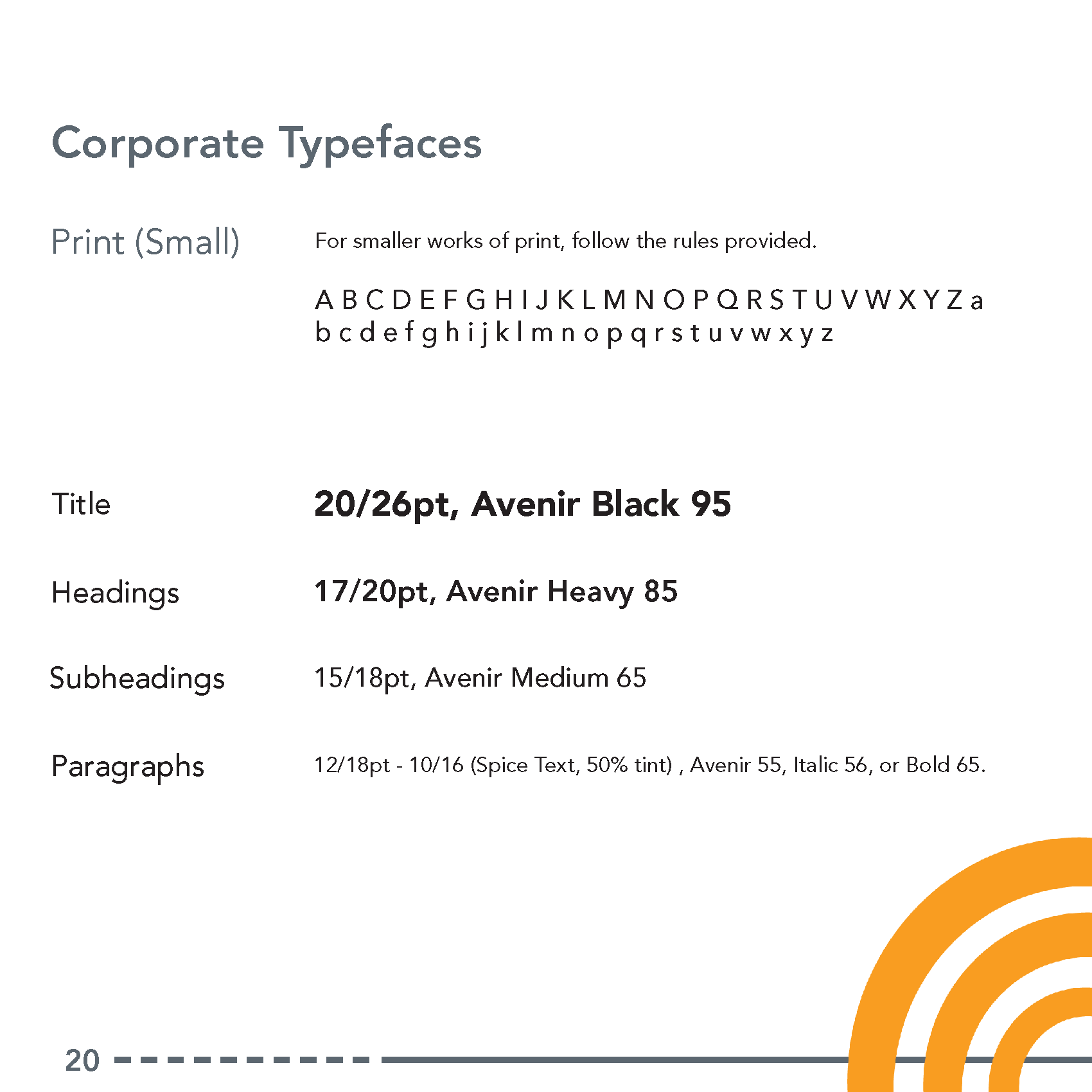
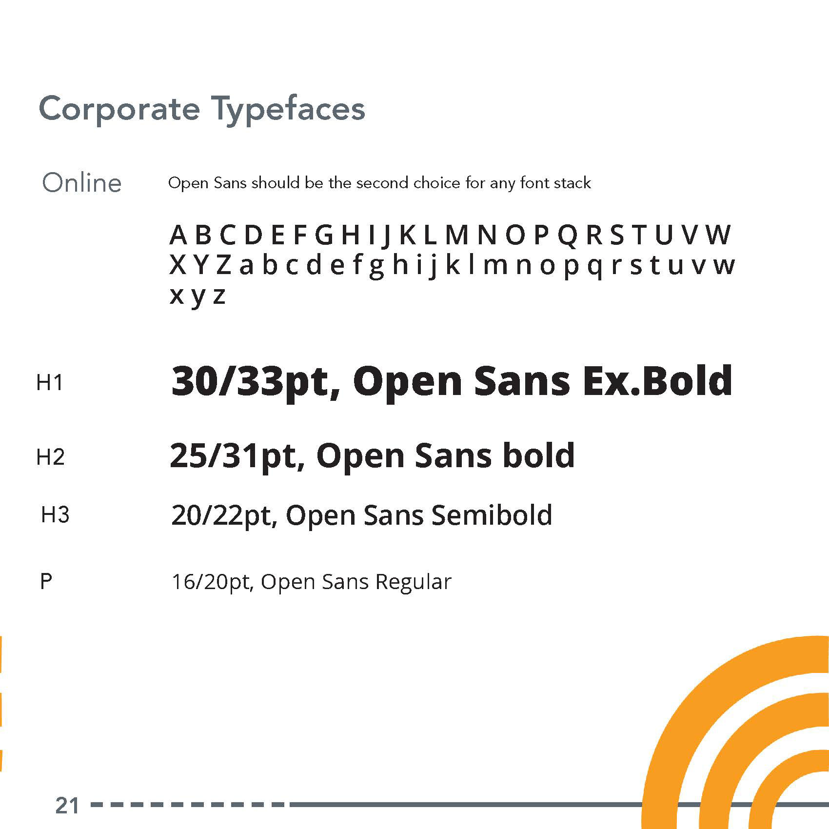
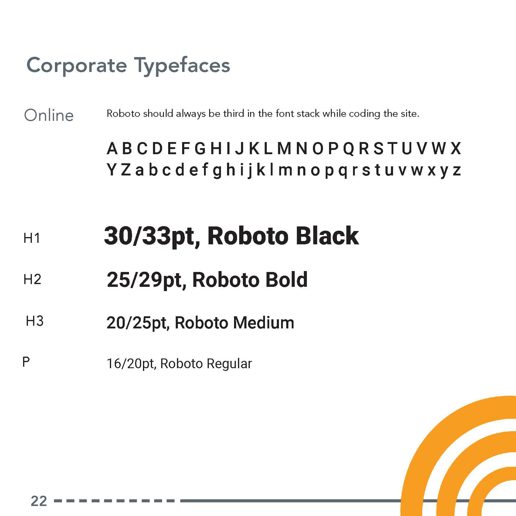
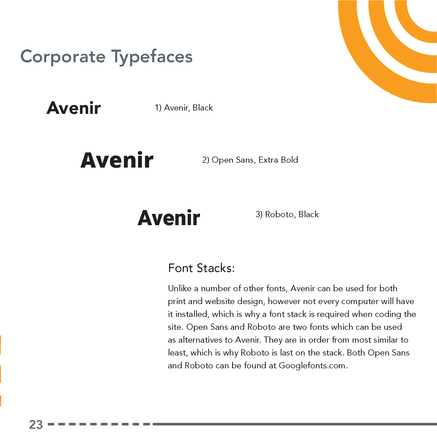
Typeface Styles
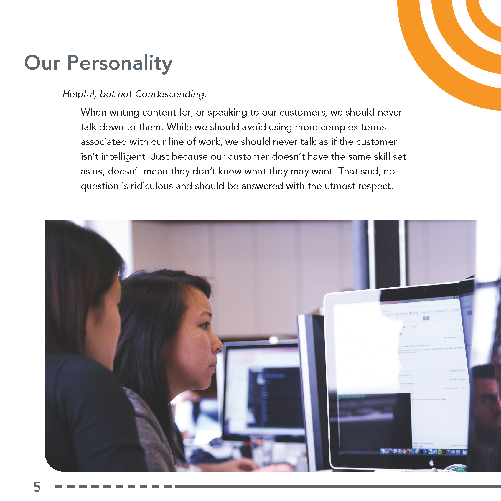
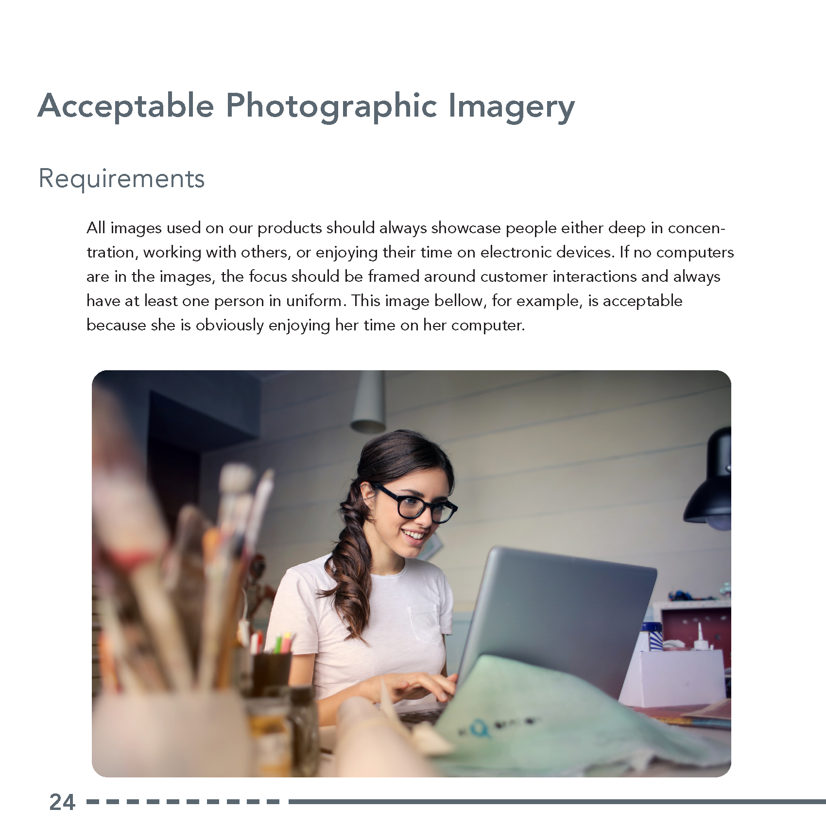
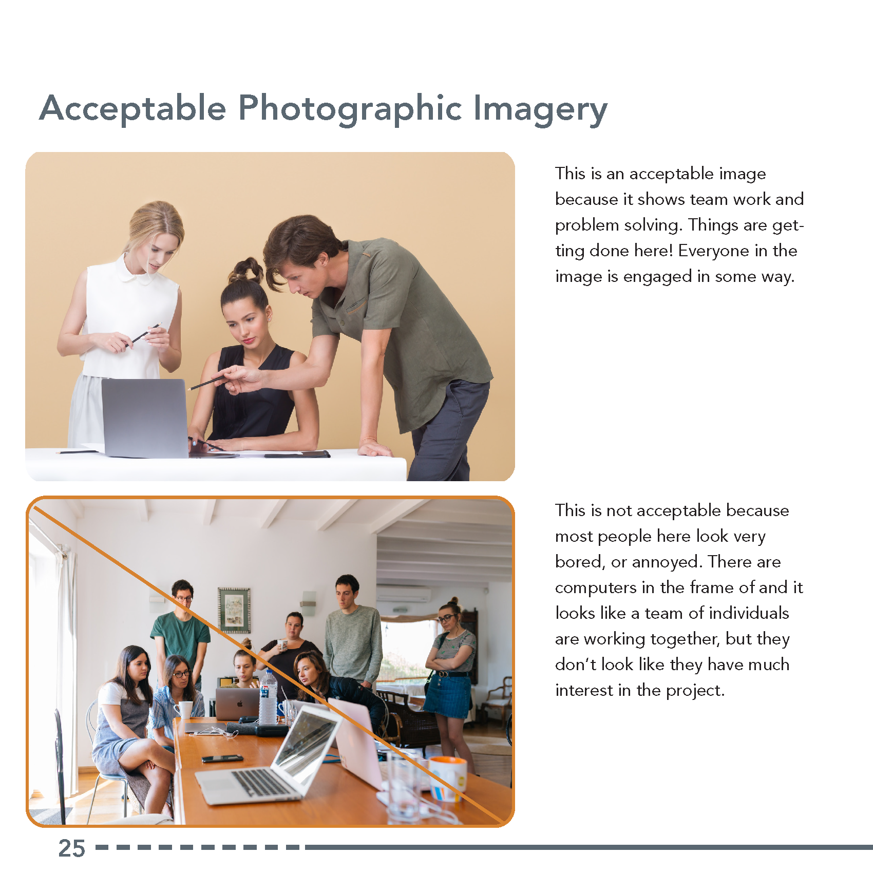
Using Photography
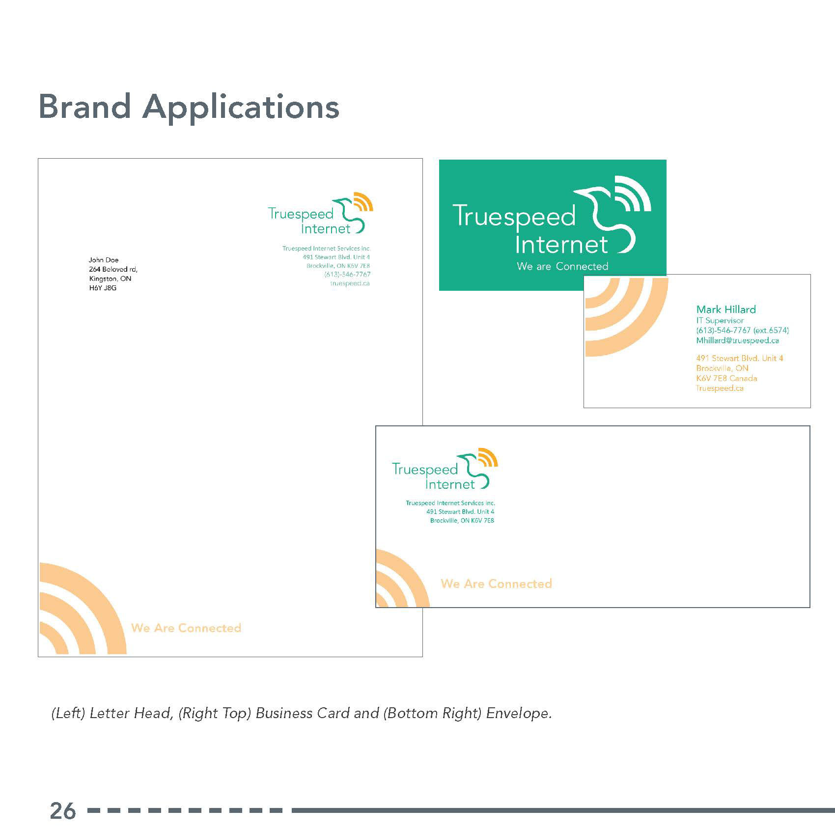
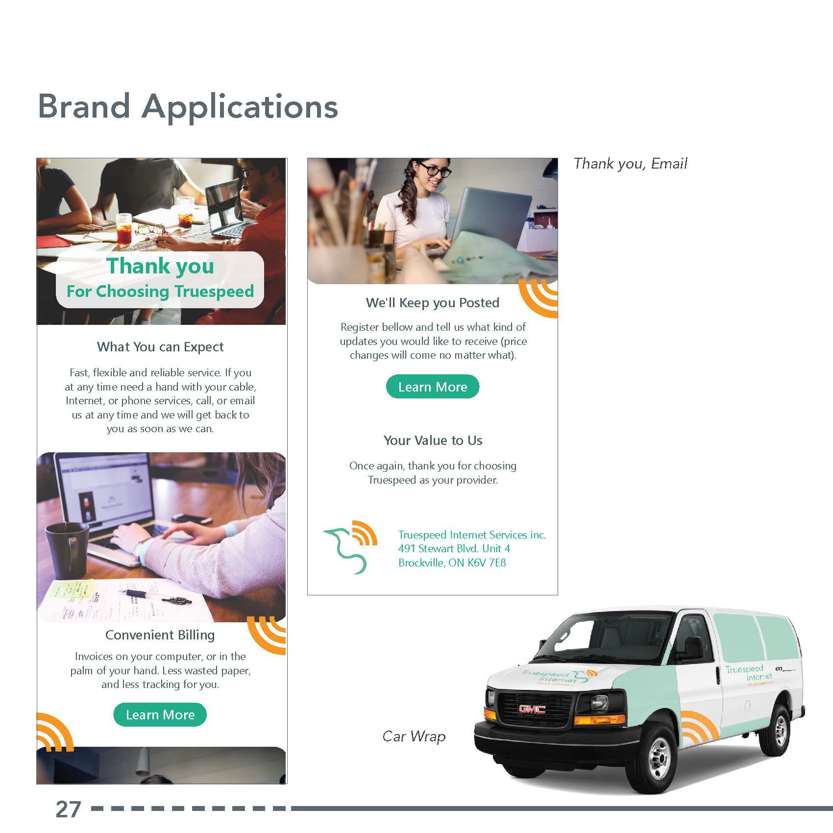
Brand Applications
Rough Brand Guide Layout
Ttile Page
Index
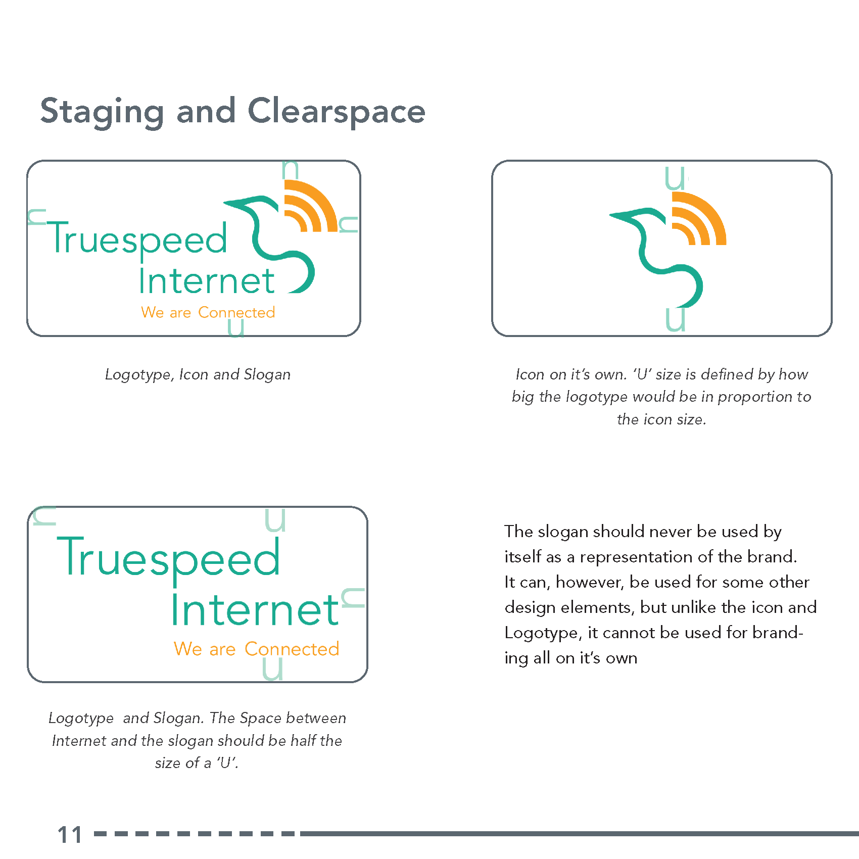
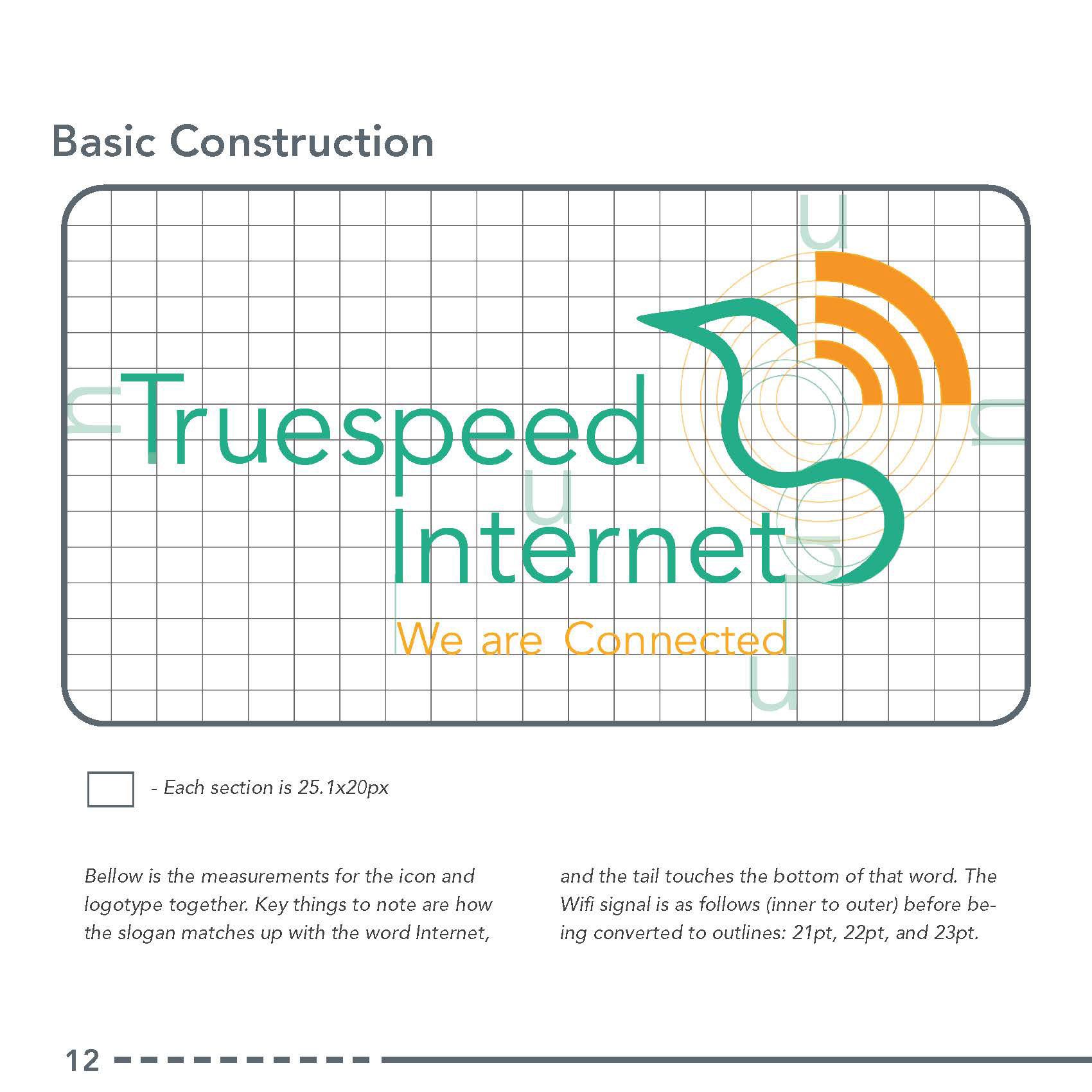
Proportions and Measurements
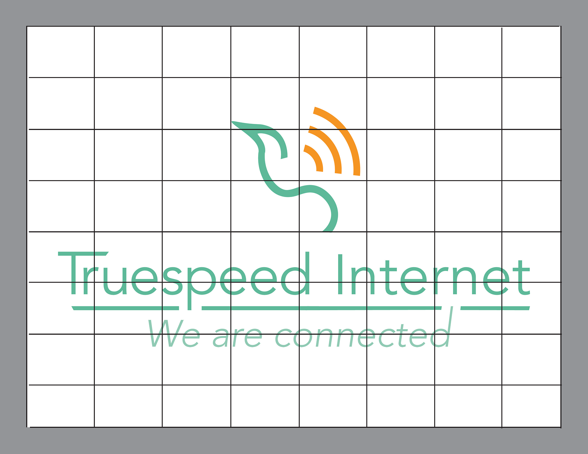
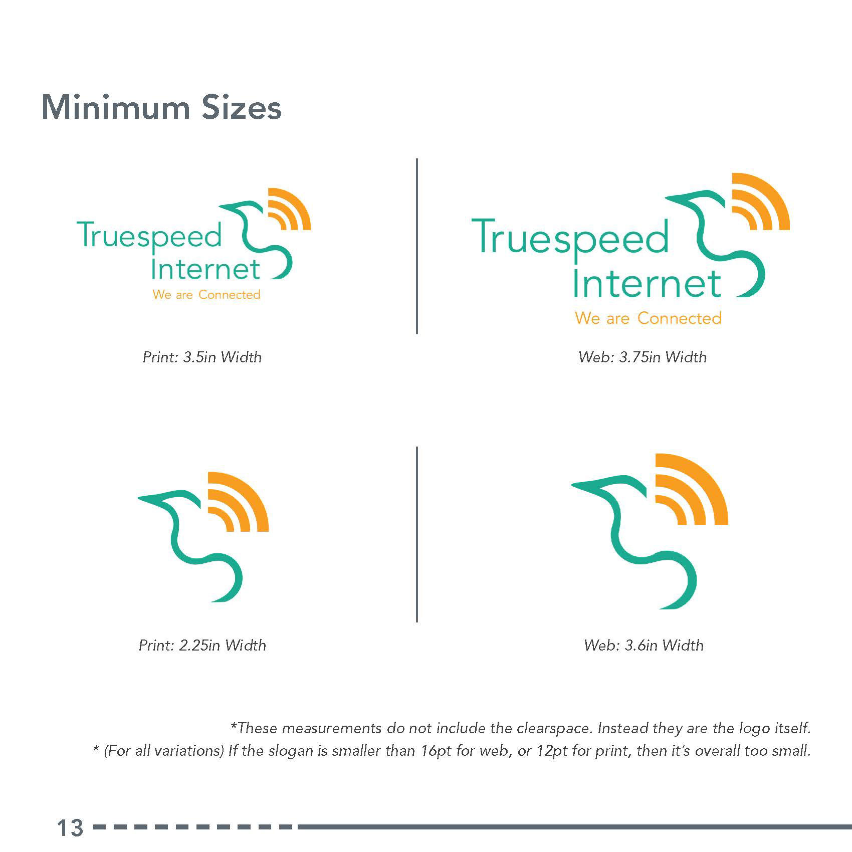
Logo Measurements
Variations and Sizes
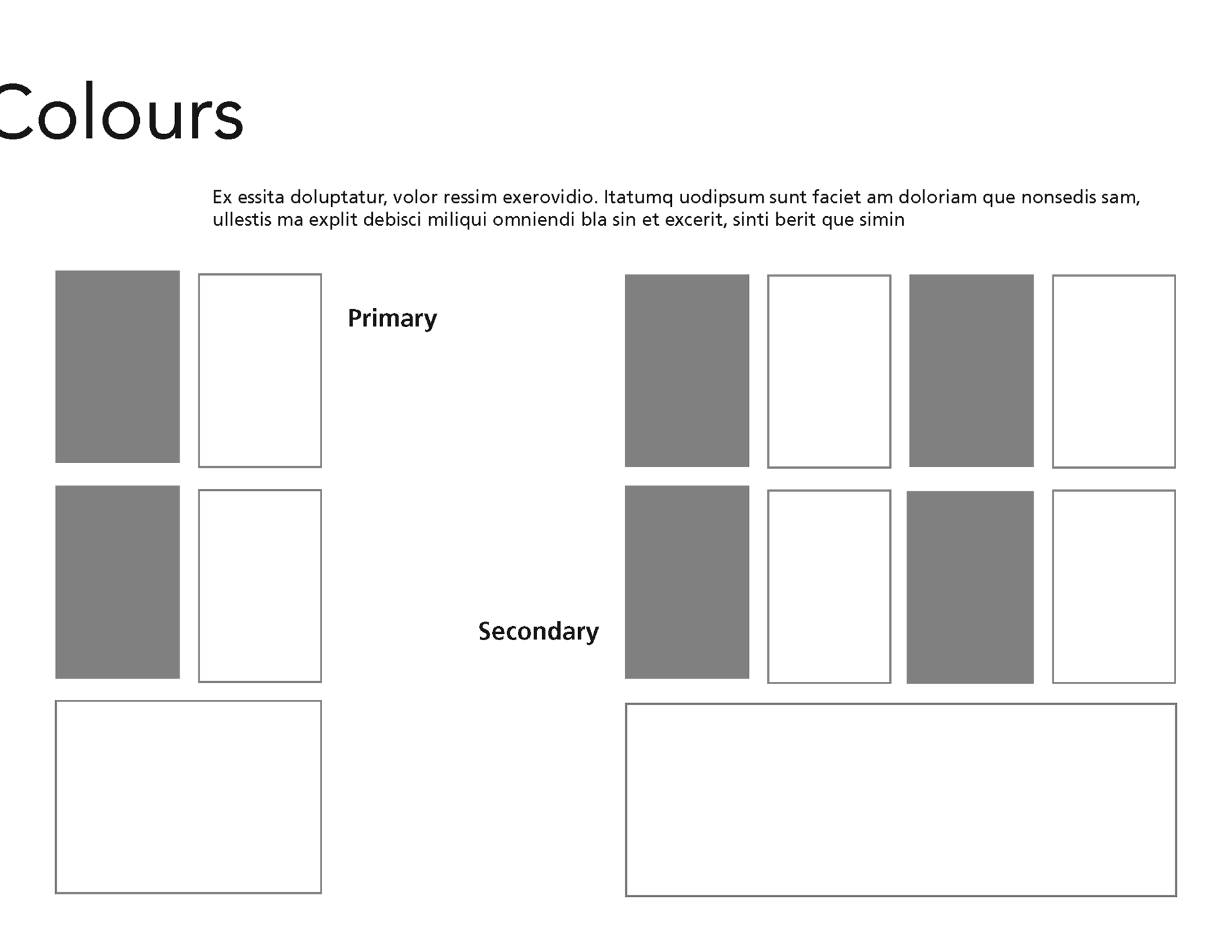
Colours
Fonts and Formatting
Acceptable Variations
Unacceptable Deviations
Graphic Patterns